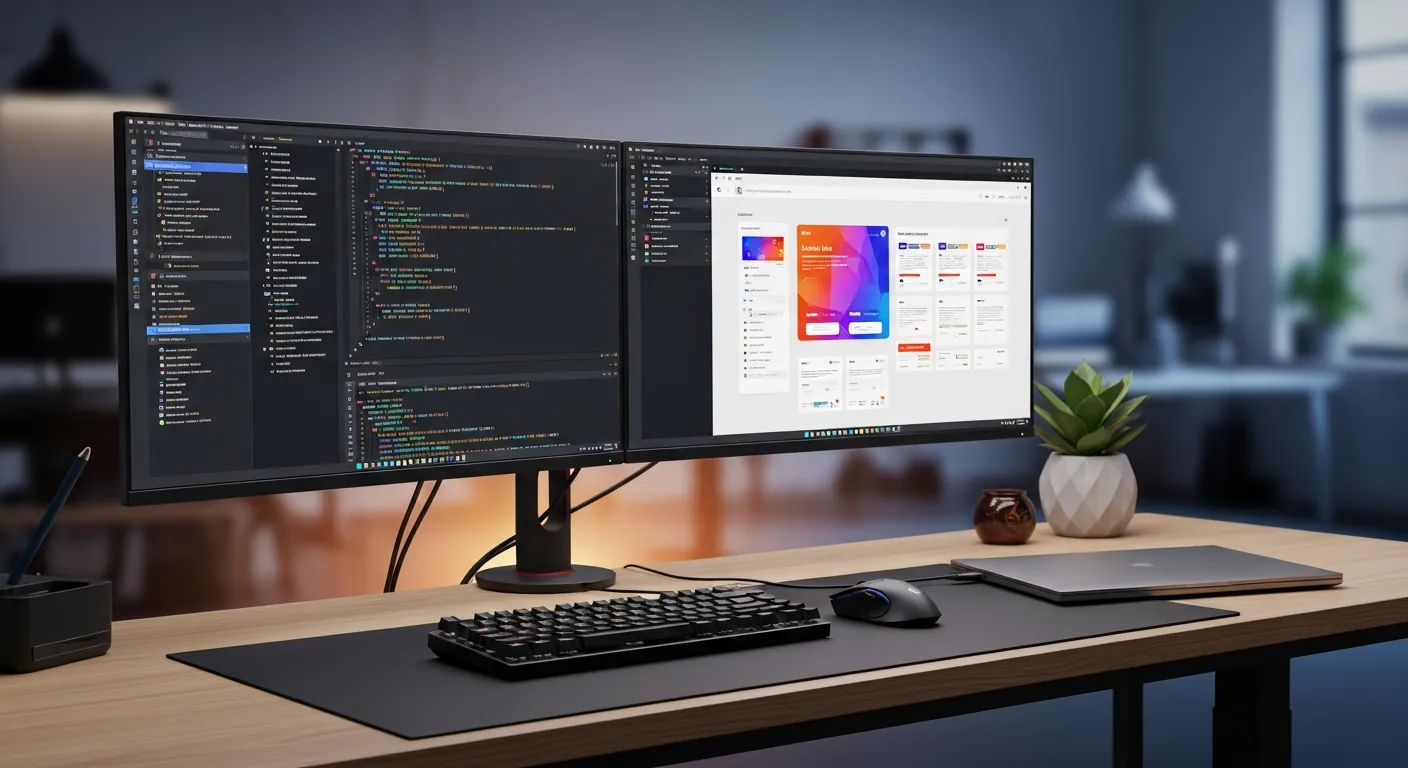
Responsive Design with Claude Code: A Practical Implementation Guide
Build responsive UI with Claude Code: mobile-first CSS, clamp, grids, images, nav, tables, and Playwright checks.

Decide the rules before Claude Code edits CSS
Responsive design is not just “make it look okay on a phone.” A useful responsive page respects screen width, input method, image weight, navigation priority, table readability, ads, and conversion paths. When you ask Claude Code only to “make this mobile friendly,” it may produce a layout that looks acceptable in one viewport while leaving hidden problems: horizontal overflow, fixed-width cards, oversized hero images, cramped navigation, or a CTA that disappears below too much content.
The reliable workflow is to give Claude Code a small but explicit contract. Mobile-first CSS means the narrow-screen layout is the default, and wider screens add enhancements. clamp() is a CSS function that sets a minimum, preferred, and maximum value in one expression. Container queries let a component respond to its parent container rather than the whole viewport. Those definitions sound basic, but they prevent a lot of vague instructions and make the generated diff much easier to review.
For official references, use MDN’s Responsive design, @container, clamp(), and responsive images. For verification, use Playwright’s Screenshots and Visual comparisons. The current Claude Code overview and How Claude Code works describe Claude Code as a tool that reads a codebase, edits files, runs commands, and verifies results. That is exactly how to treat it here: not as a design oracle, but as a coding partner with clear acceptance criteria.
For broader UI foundations, pair this article with Claude Code design systems. For interaction quality, read Claude Code accessibility. For browser-level proof, see Claude Code Playwright testing.
The implementation map
Responsive work fails when CSS is added as an afterthought. Ask Claude Code to inspect the existing page, identify the widths where each component breaks, update CSS and images together, and add a screenshot check. That keeps the task concrete and reviewable.
flowchart LR
  A["Read the existing page"] --> B["Mobile-first base CSS"]
  B --> C["Fluid grid and clamp()"]
  C --> D["Container-query components"]
  D --> E["Responsive images and tables"]
  E --> F["Playwright screenshot checks"]
This prompt is specific enough for a real repository:
Make the existing /responsive-demo page responsive.

Requirements:
- Use mobile-first CSS.
- Avoid horizontal overflow at 320px, 390px, 768px, 1024px, and 1440px.
- Keep nav, cards, pricing table, article CTA, and footer from overlapping.
- Add width/height, srcset, sizes, loading, and useful alt text to content images.
- Prefer CSS Grid, clamp(), and @container before adding JavaScript width checks.
- After the change, run Playwright screenshots and an overflow assertion.

Do not:
- Change existing URLs, conversion CTA links, or accessible heading order.
- Add large fixed min-width values that force page-level horizontal scroll.
This instruction gives Claude Code the goal, boundaries, and proof. It also makes review easier because you can reject any diff that solves the desktop view while ignoring the smaller widths.
Copy-paste HTML demo
The following page contains the patterns most teams struggle with: navigation, a hero image, cards, a side panel, and a comparison table. Replace the image paths with your own assets and open it next to the CSS in the next section. In a production app you can split it into React, Astro, Vue, or server-rendered templates, but starting with plain HTML keeps the responsive behavior visible.
<!doctype html>
<html lang="en">
  <head>
    <meta charset="utf-8" />
    <meta name="viewport" content="width=device-width, initial-scale=1" />
    <title>Responsive Demo</title>
    <link rel="stylesheet" href="./responsive-demo.css" />
  </head>
  <body>
    <header class="site-nav">
      <a class="brand" href="/">ClaudeCodeLab</a>
      <nav class="nav-links" aria-label="Main navigation">
        <a href="/en/blog/">Articles</a>
        <a href="/en/products/">Products</a>
        <a href="/en/training/">Consulting</a>
      </nav>
    </header>

    <main class="page-shell">
      <section class="hero">
        <div>
          <p class="eyebrow">Responsive Design</p>
          <h1>Design the small screen first, then let the layout grow</h1>
          <p class="lead">
            Implement mobile-first CSS, fluid grids, responsive images, and Playwright checks as one workflow.
          </p>
          <a class="primary-cta" href="/en/products/">View prompt templates</a>
        </div>
        <picture class="hero-media">
          <source
            type="image/avif"
            srcset="/images/responsive-demo-640.avif 640w, /images/responsive-demo-1280.avif 1280w"
            sizes="(width < 768px) 92vw, 40vw"
          />
          <img
            src="/images/responsive-demo-1280.jpg"
            alt="A phone and laptop showing the same responsive page"
            width="1280"
            height="900"
            loading="eager"
            decoding="async"
          />
        </picture>
      </section>

      <div class="layout-grid">
        <aside class="side-panel" aria-label="Viewport checklist">
          <h2>Widths to verify</h2>
          <ul>
            <li>320px: smallest phone</li>
            <li>390px: common phone</li>
            <li>768px: tablet</li>
            <li>1024px and up: desktop</li>
          </ul>
        </aside>

        <section class="cards" aria-label="Improvement cards">
          <article class="card featured">
            <img src="/images/card-layout.jpg" alt="" width="720" height="480" loading="lazy" />
            <div class="card-body">
              <h2>Let cards respond to their container</h2>
              <p>Use container width, not only viewport width, to adjust density inside reusable components.</p>
            </div>
          </article>
          <article class="card">
            <div class="card-body">
              <h2>Allow nav to wrap</h2>
              <p>Do not squeeze every desktop link into one mobile row. Preserve tap targets and readable labels.</p>
            </div>
          </article>
          <article class="card">
            <div class="card-body">
              <h2>Keep table meaning</h2>
              <p>On narrow screens, turn rows into cards and expose column labels with `data-label`.</p>
            </div>
          </article>
        </section>
      </div>

      <section class="comparison">
        <h2>Plan comparison</h2>
        <table class="responsive-table">
          <thead>
            <tr>
              <th scope="col">Item</th>
              <th scope="col">Solo</th>
              <th scope="col">Team</th>
            </tr>
          </thead>
          <tbody>
            <tr>
              <td data-label="Item">Goal</td>
              <td data-label="Solo">Learning and small improvements</td>
              <td data-label="Team">Consistent review standards</td>
            </tr>
            <tr>
              <td data-label="Item">Proof</td>
              <td data-label="Solo">Local Playwright run</td>
              <td data-label="Team">CI screenshots</td>
            </tr>
          </tbody>
        </table>
      </section>
    </main>
  </body>
</html>
Mobile-first CSS with fluid grids and clamp
The CSS starts with the narrow layout. Wider screens add columns later. This avoids the common desktop-first trap where every mobile rule has to undo a desktop assumption. The card grid uses repeat(auto-fit, minmax(...)), spacing and type use clamp(), and the featured card changes only when its own container is wide enough.
* {
  box-sizing: border-box;
}

body {
  margin: 0;
  color: #172033;
  background: #f7f8fb;
  font-family: system-ui, -apple-system, BlinkMacSystemFont, "Segoe UI", sans-serif;
}

img {
  display: block;
  max-width: 100%;
  height: auto;
}

.site-nav,
.page-shell {
  width: min(100% - 2rem, 72rem);
  margin-inline: auto;
}

.site-nav {
  display: flex;
  align-items: center;
  justify-content: space-between;
  gap: 1rem;
  flex-wrap: wrap;
  padding-block: 1rem;
}

.brand,
.nav-links a,
.primary-cta {
  min-height: 44px;
  display: inline-flex;
  align-items: center;
}

.nav-links {
  display: flex;
  gap: 0.5rem;
  flex-wrap: wrap;
}

.nav-links a {
  padding-inline: 0.75rem;
  color: inherit;
  text-decoration: none;
}

.page-shell {
  padding-block: clamp(1rem, 4vw, 3rem);
}

.hero {
  display: grid;
  gap: clamp(1rem, 4vw, 2.5rem);
  align-items: center;
}

.eyebrow {
  color: #0f766e;
  font-weight: 700;
}

.hero h1 {
  max-width: 11ch;
  margin: 0;
  font-size: clamp(2.25rem, 10vw, 5rem);
  line-height: 1.02;
}

.lead {
  max-width: 62ch;
  font-size: clamp(1rem, 2vw, 1.25rem);
  line-height: 1.8;
}

.primary-cta {
  width: fit-content;
  border-radius: 0.5rem;
  padding-inline: 1rem;
  background: #172033;
  color: white;
  text-decoration: none;
  font-weight: 700;
}

.hero-media img,
.card {
  border-radius: 0.75rem;
  box-shadow: 0 18px 50px rgb(15 23 42 / 0.12);
}

.layout-grid {
  display: grid;
  gap: clamp(1rem, 3vw, 2rem);
  margin-block-start: 2rem;
}

.side-panel,
.card,
.comparison {
  background: white;
  border: 1px solid #dbe3ef;
  border-radius: 0.75rem;
}

.side-panel {
  padding: 1rem;
}

.cards {
  container: cards / inline-size;
  display: grid;
  grid-template-columns: repeat(auto-fit, minmax(min(100%, 18rem), 1fr));
  gap: 1rem;
}

.card {
  overflow: hidden;
}

.card-body {
  display: grid;
  gap: 0.75rem;
  padding: 1rem;
}

.card h2,
.comparison h2 {
  margin: 0;
  font-size: clamp(1.25rem, 3vw, 1.75rem);
}

@container cards (width >= 42rem) {
  .card.featured {
    grid-column: span 2;
    display: grid;
    grid-template-columns: minmax(14rem, 0.8fr) 1fr;
  }

  .card.featured img {
    height: 100%;
    object-fit: cover;
  }
}

.comparison {
  margin-block-start: 2rem;
  padding: 1rem;
  overflow-x: auto;
}

.responsive-table {
  width: 100%;
  border-collapse: collapse;
}

.responsive-table th,
.responsive-table td {
  padding: 0.875rem;
  border-block-end: 1px solid #dbe3ef;
  text-align: left;
}

@media (width < 48rem) {
  .responsive-table thead {
    position: absolute;
    inline-size: 1px;
    block-size: 1px;
    overflow: hidden;
    clip: rect(0 0 0 0);
  }

  .responsive-table,
  .responsive-table tbody,
  .responsive-table tr,
  .responsive-table td {
    display: block;
    width: 100%;
  }

  .responsive-table tr {
    border: 1px solid #dbe3ef;
    border-radius: 0.5rem;
    margin-block: 0.75rem;
    overflow: hidden;
  }

  .responsive-table td {
    display: grid;
    grid-template-columns: minmax(7rem, 40%) 1fr;
    gap: 1rem;
  }

  .responsive-table td::before {
    content: attr(data-label);
    font-weight: 700;
    color: #526071;
  }
}

@media (width >= 64rem) {
  .hero {
    grid-template-columns: minmax(0, 1.1fr) minmax(18rem, 0.9fr);
  }

  .layout-grid {
    grid-template-columns: 16rem minmax(0, 1fr);
  }

  .side-panel {
    position: sticky;
    top: 1rem;
    align-self: start;
  }
}
The important detail is not the exact color or border radius. It is the absence of large fixed widths. width: min(100% - 2rem, 72rem) leaves room on small screens and caps the reading width on large screens. minmax(min(100%, 18rem), 1fr) prevents the card minimum from punching through a narrow container.
Practical patterns for images, nav, cards, and tables
Give Claude Code component-level rules instead of a generic “make it responsive” request. A simple table in your prompt or issue description reduces vague output.
| Component | Common failure | Ask Claude Code to fix |
|---|---|---|
| Navigation | Desktop links are squeezed into one mobile row | Allow wrapping, preserve tap targets, and keep aria-label |
| Cards | width: 320px or large min-width creates overflow | Use auto-fit, minmax(), and container queries |
| Images | The same large JPEG is served to phones | Add srcset, sizes, width, height, loading, and useful alt text |
| Tables | Columns collapse into unreadable text | Choose wrapper scrolling or row cards, keeping labels with data-label |
| CTA | Revenue links are buried below heavy media | Check the first mobile scroll and the article footer |
Not every small screen needs a hamburger menu. If the navigation has three links, wrapping may be faster and more transparent. Not every table should become a card either. A pricing matrix may need horizontal comparison, while a ticket list is often easier to read as row cards. Ask Claude Code to preserve the reader’s task, not simply the desktop shape.
Images deserve special attention because they affect both performance and revenue. A heavy hero image can delay the moment when the reader sees your CTA. Ask for srcset and sizes, not just “optimize images.” Also ask Claude Code to keep decorative images with empty alt attributes and content images with descriptive alt text.
Use cases worth testing
The first use case is a SaaS dashboard. It combines a sidebar, filters, stat cards, charts, and a data table. On mobile, “stack everything” is usually not enough. Ask Claude Code to show primary KPI cards first, collapse secondary filters, and turn detailed rows into readable cards.
The second use case is a blog or media site. Body width, table of contents, ads, related posts, and a free PDF CTA compete for space. Here the goal is readable line length, lighter images, code blocks that do not overflow, and CTAs that remain visible after long examples.
The third use case is an ecommerce or course landing page. Product cards, price comparison, checkout buttons, and FAQ blocks have direct revenue impact. If the price or buy button falls too far down on mobile, conversion suffers. Give Claude Code the required CTA order and ask it to verify screenshots.
The fourth use case is an internal admin screen. Daily users care less about visual drama and more about search, filters, keyboard operation, and tables. Responsive improvements should protect the work sequence people already use.
Playwright screenshot and overflow checks
Do not stop at “I opened it in the browser.” Playwright can check representative viewport sizes, assert that important elements are visible, detect horizontal overflow, and save screenshots for review.
import { expect, test } from "@playwright/test";

const baseUrl = process.env.PLAYWRIGHT_BASE_URL ?? "http://127.0.0.1:3000";

const viewports = [
  { name: "mobile-320", width: 320, height: 740 },
  { name: "mobile-390", width: 390, height: 844 },
  { name: "tablet-768", width: 768, height: 1024 },
  { name: "desktop-1440", width: 1440, height: 1000 },
];

for (const viewport of viewports) {
  test(`responsive demo has no horizontal overflow at ${viewport.name}`, async ({ page }) => {
    await page.setViewportSize({ width: viewport.width, height: viewport.height });
    await page.goto(`${baseUrl}/responsive-demo`);

    await expect(page.getByRole("navigation", { name: "Main navigation" })).toBeVisible();
    await expect(page.getByRole("link", { name: "View prompt templates" })).toBeVisible();

    const hasHorizontalOverflow = await page.evaluate(() => {
      return document.documentElement.scrollWidth > document.documentElement.clientWidth;
    });

    expect(hasHorizontalOverflow).toBe(false);
    await expect(page).toHaveScreenshot(`responsive-${viewport.name}.png`, {
      fullPage: true,
      maxDiffPixels: 300,
    });
  });
}
The first run creates baseline screenshots. Update them with npx playwright test --update-snapshots only when the design change is intentional. Screenshot comparison can vary by operating system, font rendering, GPU, and headless settings, so generate and compare baselines in a consistent environment.
Pitfalls to catch in review
The biggest pitfall is desktop-first CSS with mobile overrides piled on top. It works for a while, then the cascade becomes hard to reason about. Ask Claude Code to move the narrow layout into the base rules and add wider layouts later.
The second pitfall is a missing <meta name="viewport">. Without it, mobile browsers can render the page with a virtual desktop width, which makes your CSS checks misleading. Verify the shared HTML layout, not only the page component.
The third pitfall is fixed widths hiding in cards, tables, images, or embedded widgets. min-width: 960px may look harmless on a desktop monitor and still break every phone. If a table must scroll, put overflow-x: auto on the table wrapper rather than the whole page.
The fourth pitfall is adding srcset without sizes. The browser needs both the available image candidates and a useful hint about the rendered size. Ask Claude Code to update srcset, sizes, width, height, and alt together.
The fifth pitfall is trusting screenshot tests alone. Screenshots are useful for visual review but noisy around ads, dates, animations, and third-party widgets. Combine screenshots with DOM assertions for overflow, visible CTAs, and navigation landmarks.
Include the revenue path
Responsive design should support the business goal of the page. For this site, that means a reader can still find the free PDF, Gumroad products, and consultation path on a phone. ClaudeCodeLab offers Claude Code products and prompt templates for people who want reusable workflows, and Claude Code training and consulting for teams that want to improve real screens with review rules and Playwright proof.
When you brief Claude Code, include the conversion path in the acceptance criteria. A layout that looks clean but hides the purchase button or inquiry link is not finished.
Summary
The practical Claude Code workflow for responsive design is: define the mobile-first contract, build fluid grids, use clamp() for type and spacing, use container queries for reusable components, handle images deliberately, adapt navigation and tables to the reader’s task, and verify the result with Playwright.
I tested the demo pattern locally at 320px, 390px, 768px, and 1440px. The nav wrapped instead of overflowing, cards collapsed to one column on phones, the table became readable row cards, and the Playwright overflow assertion passed. Masa’s practical takeaway is that Claude Code is most useful when it implements and then acts as a reviewer for fixed widths, image hints, CTA placement, table behavior, and screenshot differences.
Related Posts

CSS Grid Mastery with Claude Code
Build practical CSS Grid layouts with Claude Code: areas, minmax, auto-fit cards, pitfalls, and reusable code.

Claude Code Media Queries: Mobile-First CSS Guide
Build responsive CSS with Claude Code: media queries, container queries, prefers settings, and Playwright checks.
Design Tokens with Claude Code: From Figma Handoff to CSS Variables and Tailwind
Implement design tokens with Claude Code, Style Dictionary, CSS variables, Tailwind, and React.
Free PDF: Claude Code Cheatsheet
Enter your email and download the one-page Claude Code cheatsheet for commands, review habits, and safe workflows.
We handle your data with care and never send spam.
Level up your Claude Code workflow
Start with the free PDF, use Gumroad guides when you need repeatable workflows, and book consultation when rollout or revenue paths need human judgment.

About the Author
Masa
Engineer focused on practical Claude Code workflows. Runs claudecode-lab.com, a 10-language technical media site.
Related Products
50 Battle-Tested Claude Code Prompt Templates
Copy, paste, ship. 50 production-ready prompts.
Use proven prompts for code review, refactoring, testing, documentation, debugging, architecture, and incident response.
The Complete Claude Code Setup & Configuration Guide
From install to team-ready workflow.
A practical guide to installation, CLAUDE.md, hooks, MCP servers, permissions, IDE setup, and CI/CD workflows.